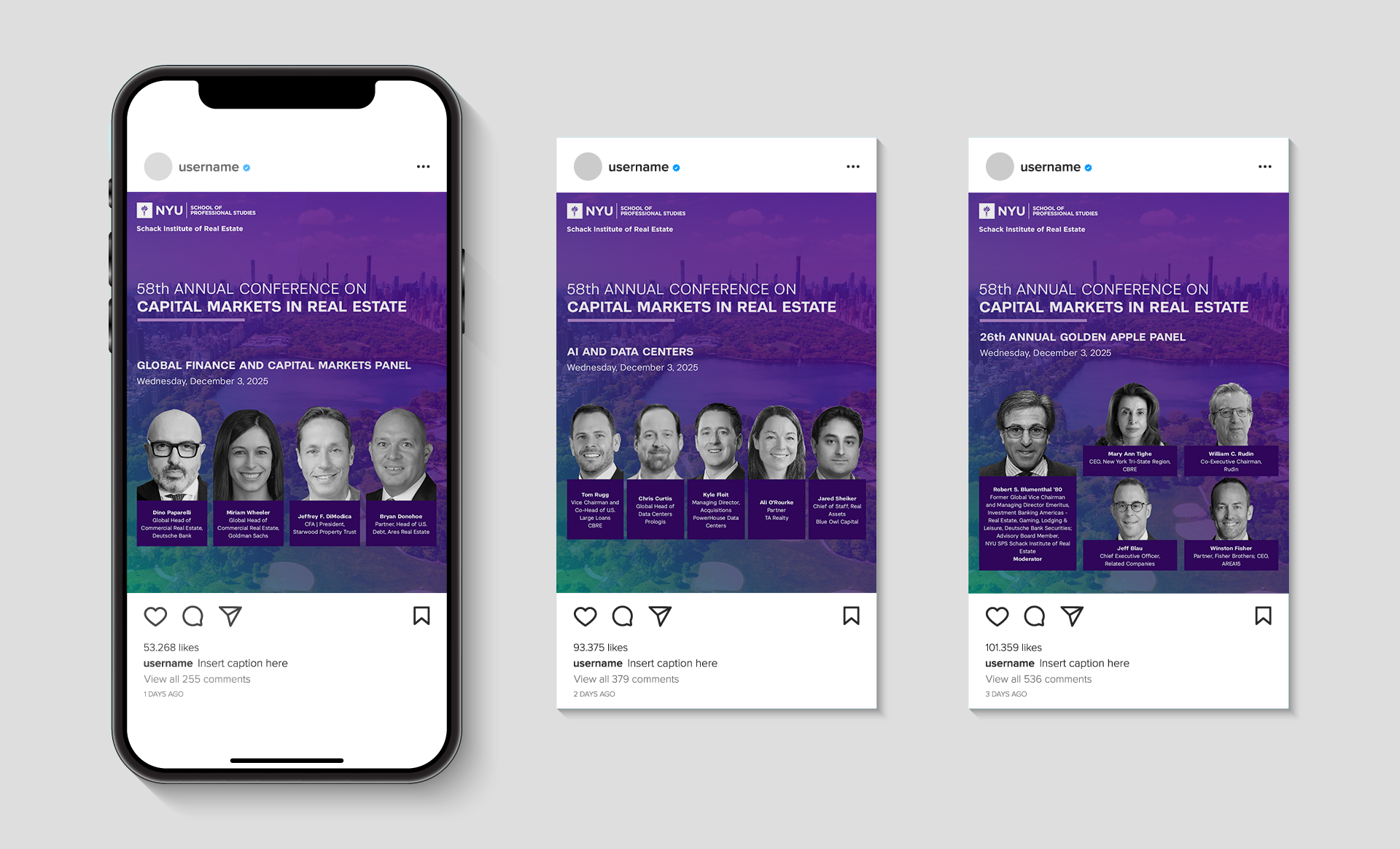
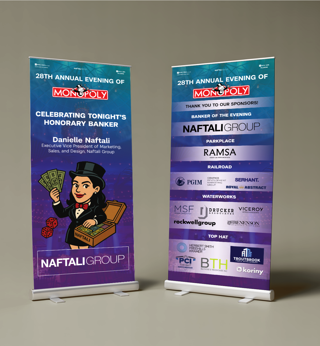
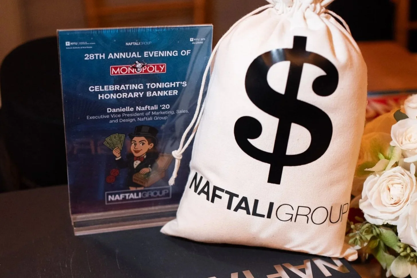
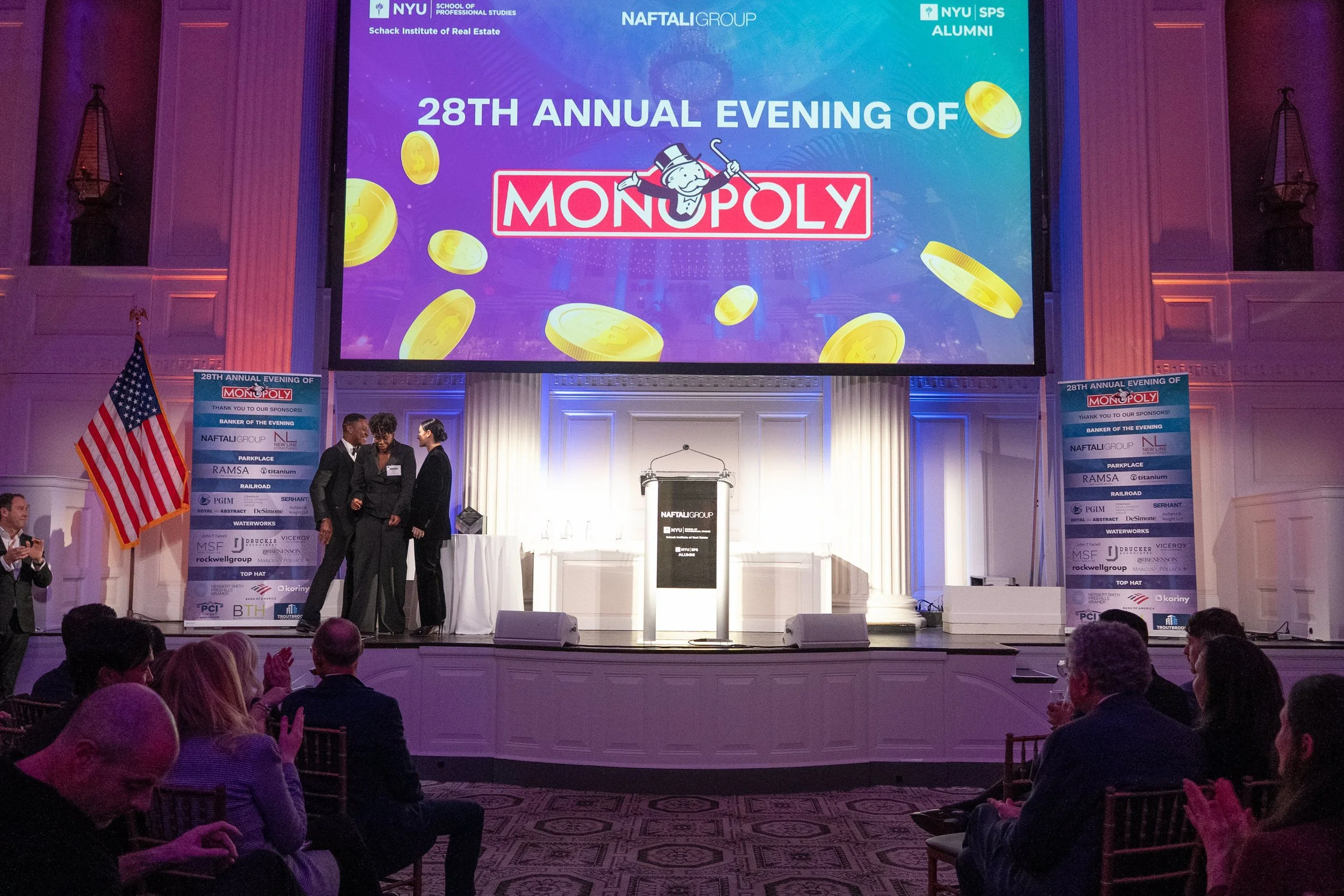
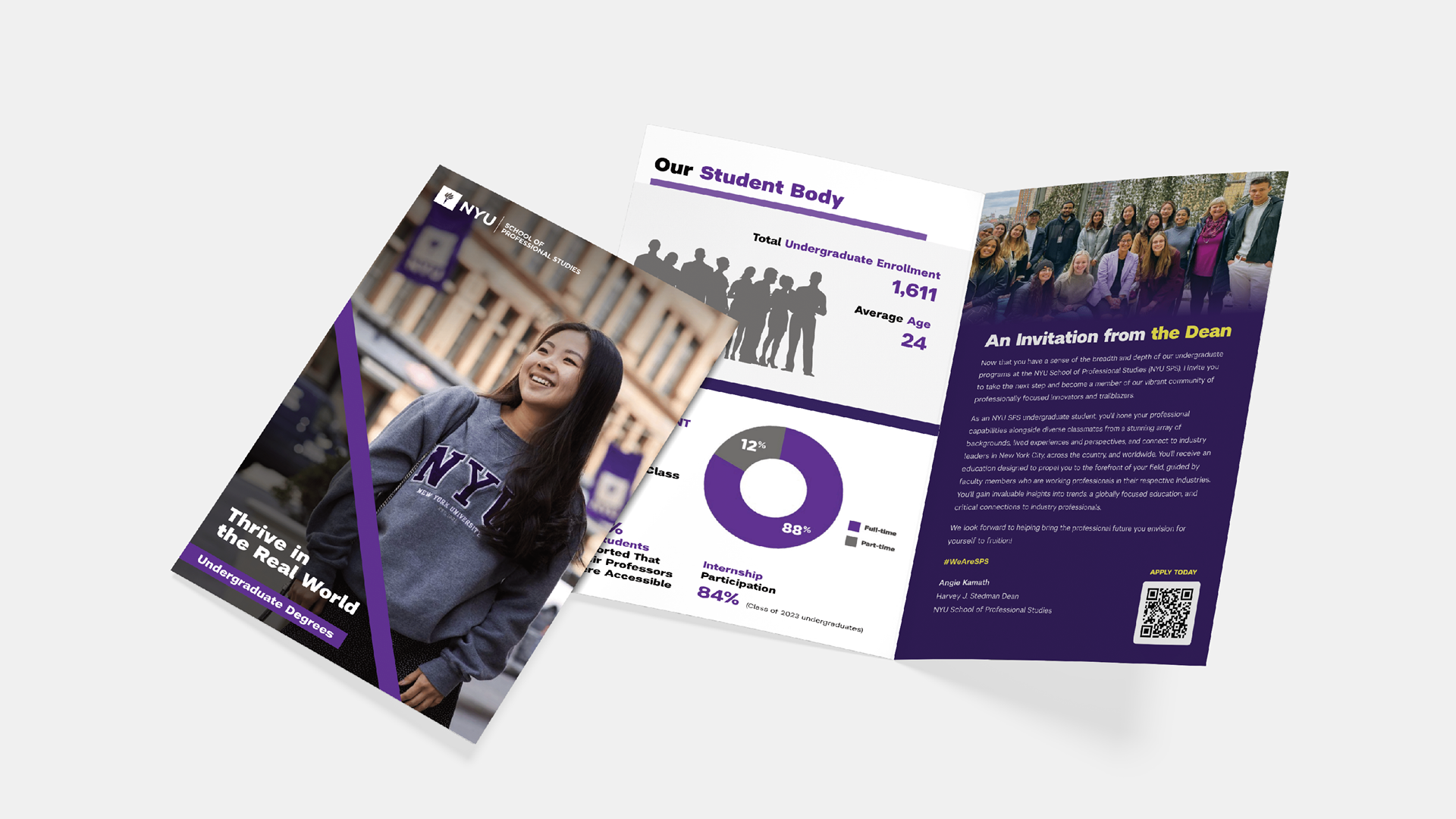
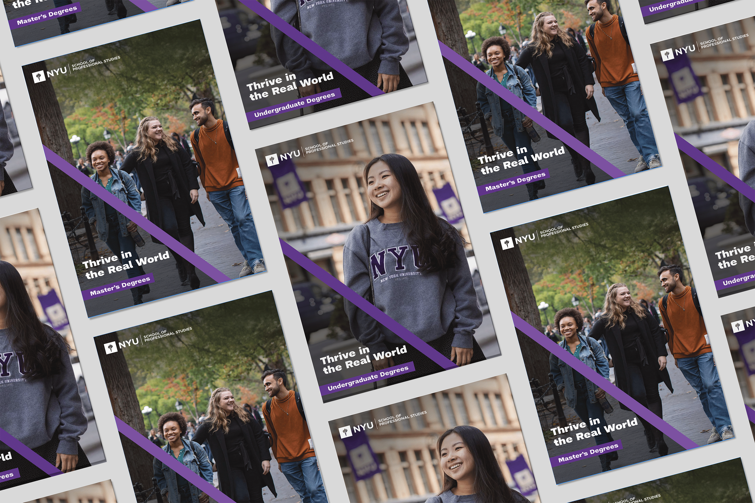
NYU SPS Visual Communications
A series of layout-driven visual materials designed for NYU School of Professional Studies, balancing institutional clarity with editorial rhythm across print and digital formats.
58th Capital Markets Conference
Brief:
Produce a full set of promotional graphics for each speaker panel at the NYU Schack Capital Markets Conference. Assets include Instagram posts, LinkedIn graphics, and email blast visuals that highlight panel titles, speakers, and key themes.
Designs should follow the established conference identity and reflect the values and visual language of both NYU and the real estate industry. Each asset must be optimized for its platform while staying consistent in layout, typography, and visual hierarchy to support outreach to a professional audience.
Designing and adapting layouts across multiple format sizes:
Created dedicated graphics to honor Samantha Rudin Earls as the CMC Next Generation Leadership Awardee, producing tailored assets for each platform, including an email banner, Instagram post and story, and LinkedIn graphic.
Professional Development & Leadership Hub Brochure
Project Overview:
PDL Hub Brochure Redesign
This project involved a comprehensive redesign of the Professional Development & Leadership (PDL) Hub Brochure to align with the School of Professional Studies (SPS) brand evolution (new website) and modern accessibility standards. The primary goal was to transform the document into a high-performance digital asset that is as inclusive as it is visually compelling.
Color Minimalism:
Deep Violet & NYU Violet: Used for primary branding, headings, and high-impact UI elements (such as links).
Light Purple: Utilized for secondary accents and subtle backgrounds.
Light Gray: Employed for body and neutral spacing to maximize readability and reduce eye strain.
Accessibility:
The brochure was built from the ground up to be WCAG-compliant. Following Adobe’s accessibility guidelines, I implemented proper tagging, logical alt-text, and ensured all color combinations met or exceeded the required contrast ratios for low-vision users.
SPS Web Alignment:
I mirrored the UI/UX language of the new SPS website, focusing on clean lines, generous white space, and a bold typographic hierarchy, to create a unified brand ecosystem. This ensures a seamless brand experience for users moving between web platforms and marketing collateral.
Old Design Cover
Redesign Cover
NYU SCHACK MONOPOLY NIGHT
This project involved the end-to-end design and production of promotional and event-day material for the NYU Schack Institute of Real Estate’s "Monopoly Night." The objective was to create a cohesive visual experience that celebrated the achievements of honoree Danielle Naftali while driving engagement across digital and physical platforms.
To create the identity of the 28th Annual Evening of Monopoly for NYU, I blended the vaulted architectural soul of 583 Park Avenue with the fearless, lifestyle-forward branding style of Danielle Naftali. The visual identity centers on a rigorous, high-contrast palette: deep NYU Violet, blue and teal gradients, punctuated by a strategic Monopoly Red accent to inject an element of play. By anchoring the design with crisp white typography for structural clarity and prestige, I ensured a cohesive visual ecosystem that honored NYU’s branding while maintaining a strict color logic across all print and digital touchpoints.
583 Park Avenue: a space defined by grand proportions and classic NY elegance.
The high-energy atmosphere was anchored by a cohesive visual ecosystem for 250+ industry leaders and NYU Schack alumni. From dynamic multimedia honoring Danielle Naftali to bespoke Monopoly-themed catering graphics, every detail reinforced the brand narrative. The Step and Repeat became a social media focal point, bridging institutional prestige with a modern "red carpet" pulse to create a premium, immersive experience for the next generation of real estate.
NYU SPS Viewbook
Adobe InDesign, Illustrator, Photoshop
I redesigned the undergraduate viewbooks to align with NYU SPS’s refreshed digital identity. By restructuring the InDesign layouts and sourcing brand-aligned imagery, I transformed dense information into a clear, modern narrative. I prioritized accessibility through rigorous colour contrast and formatting standards, ensuring an inclusive experience.
Printed in 5000+ copies for distribution to students.

